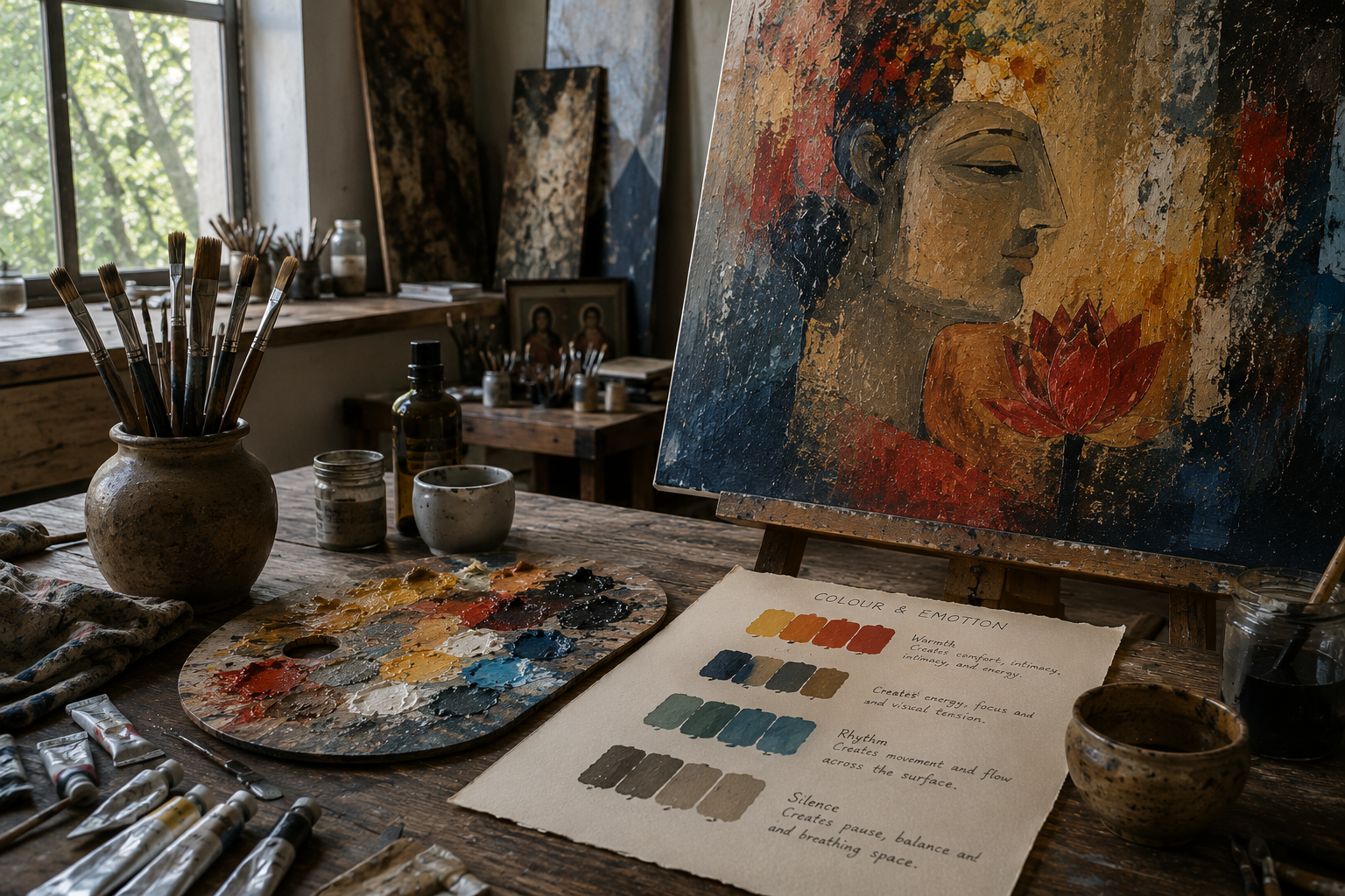
Colour is felt before it is understood
Before the eye identifies a figure, symbol, or detail, it responds to colour. A painting can feel warm, quiet, intense, ceremonial, or distant within a fraction of a second.
This emotional response is one of colour's greatest strengths. It communicates before language begins and allows a painting to establish atmosphere immediately.
At Ceramic Raja, colour is not applied simply to fill a shape. It is used to create presence, movement, pause, memory, and emotional weight.
“Colour speaks before form explains.”Ceramic Raja Studio
How colour creates energy inside a painting
Colour begins with emotion
Before selecting pigments, the artist considers what the painting must communicate. The palette develops from the emotional atmosphere of the work rather than from decoration or trend.
Warm and cool colours establish mood
Warm tones often suggest intimacy, energy, memory, or celebration. Cooler tones can introduce distance, calmness, contemplation, or silence.
Contrast creates emphasis
A bright accent against a quiet field can direct attention immediately. Strong contrast creates tension, while subtle contrast allows the eye to move more slowly.
Rhythm emerges through repetition
When colours reappear across a composition, they create visual connections. These repetitions help guide the eye and give the painting movement and coherence.
Silence gives colour meaning
Not every area needs intensity. Muted tones, neutral spaces, and restrained passages allow stronger colours to breathe and make the composition feel balanced.
Warmth can create familiarity and memory
Ochres, terracotta, crimson, saffron, and gold often feel connected to warmth, celebration, earth, ritual, and human presence. These colours can make a painting feel intimate and lived-in.
In figurative and cultural compositions, warm colours may also suggest hospitality, music, heritage, and shared memory. They create a sense of emotional closeness.
Yet too much warmth can become heavy. Cooler or quieter tones are often introduced to create balance and allow the composition to breathe.
Contrast directs attention
Contrast creates visual tension. A bright red against deep blue, a warm gold beside muted green, or a luminous figure against a dark field can guide the eye immediately.
Strong contrast creates drama and focus. Softer contrast encourages slower viewing and allows the eye to move gently across the surface.
The amount of contrast determines how quickly the painting speaks and where the viewer looks first.
Rhythm allows colour to move
When a colour appears in several places, it creates a visual relationship between distant parts of the composition. These repeated notes act like rhythm in music.
A small accent of orange may connect a figure, a background form, and a decorative detail. The repetition helps the eye travel and gives the painting a sense of movement.
Colour rhythm can feel calm and measured or lively and energetic, depending on the spacing, intensity, and sequence of the repeated tones.
Silence is also part of colour
Not every passage needs intensity. Neutral areas, faded tones, and restrained colours create silence within the painting.
These quieter passages allow stronger colours to gain meaning. Without pause, intensity becomes noise. Without restraint, the eye has nowhere to rest.
Silence gives the painting emotional depth because it allows colour to speak through contrast with what remains quiet.
Colour changes with the viewer and the room
The experience of colour is never completely fixed. Natural light, artificial light, wall colour, surrounding objects, and viewing distance all influence how a painting appears.
A blue may feel cool in daylight but richer and more intimate under warm evening light. Gold may appear subtle from a distance and more luminous when viewed closely.
The viewer's own memories also shape the experience. A colour associated with celebration for one person may suggest nostalgia or quietness for another.
The palette becomes the emotional voice of the work
A successful palette does more than make colours look harmonious. It gives the painting a distinct emotional voice.
Some works speak through warmth and celebration. Others depend on distance, silence, tension, or balance. The palette carries these qualities before the subject is fully understood.
This is why colour remains central to the Ceramic Raja practice: it transforms composition into experience and allows a painting to be felt as deeply as it is seen.